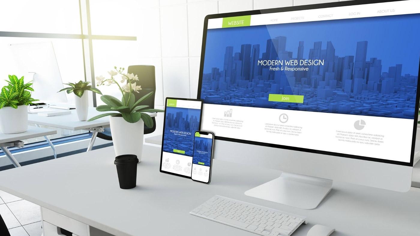
Marketers, SEO specialists, and graphic designers all have a lot to say about website design. Like those for fashion and interior design, the preferences for website design have changed throughout time and will continue to do so. Minimalist web design implies simplifying a website’s look, and the user interface is a popular trend right now.
Minimalist designs remove unnecessary tabs, menus, and other features that do not support the user’s requirements or goals. Minimalism focuses on only the most essential aspects, and you may discover minimalist principles in art, music, and literature, as well as on the internet. The goal is to eliminate as much clutter as possible; therefore, there are no pop-up videos, tabs, or dropdown menu navigation. “How does this help me reach the goal of this website?” you might wonder.
Essential Aspects of Minimalist Web Design
The four most important aspects of minimalist web design
Creating the main design elements of a simple web design carries out around many white (or any single colour) spaces. Designers use these features to remove layers and layers of clutter, resulting in a balance that is attractive to the eye and conveys a message.
Negative space
The difference between a perfect and overwhelming design is how to use negative space properly. Space is sometimes utilised as a backdrop for layout elements or used to draw attention to a specific message or call-to-action.
Graphics
Graphics that are large, dramatic, and contrasted create the tone for a successful minimalist site design. All photos, videos, and even typography that make up the site’s first impression are considered visuals.
Typography
Bold headline fonts coupled with minor, legible body text have a significant impact on minimalism. Users want to know what a website is about when they visit it. Typography gives dynamic graphics and white space a depth of life and meaning.
Colours
Minimalist web design uses various hues, ranging from neutrals and pastels to primaries and neons, to connect all design elements and create a seamless visual experience. Colour evokes emotion, allowing the design and language to communicate with users on a more visceral level.

10 Benefits of Having a Minimalist Web Design for your Business
Consider these ten advantages of minimalist web design.
Improved page loading times
The rate at which a page gets loaded speed is one of the most important criteria for all brands or businesses. Web pages that fast load, i.e., in less than 3 seconds, have a reduced bounce rate and more visitors. There are fewer items in minimalist web design that can cause a page to load slowly for consumers. With the fast loading of websites on all devices, especially mobile-friendly, the chance is higher of ranking top in the search results and site visitors.
Eye-catching content
Numerous websites use fancy web design elements and functionality to hide the presence of terrible content or no content at all. The truth is that visitors enjoy SEO friendly, engaging, and high-quality website content. Customers require a visual argument to persuade them that the specific product or service is superior to others. The more informative and persuasive the content is, the more probable it is to convert leads into buyers.
Improves conversion rates
Get a strong foundation for improved conversion rates when combining clear and compelling content with simple design. Users in today’s world do not want to spend time figuring out what a website is about or what kind of products or services they are trying to sell. Instead, a high-quality image with a short tagline can tell the whole story about what you want to sell. Minimalism provides precisely that, as well as improves conversion.
Always in style
Minimalism does not have any effect due to changing trends, so it requires low maintenance. It is easily applicable on mobile devices, desktop computers, and even smartwatches. It is cross-platform compatible and part of an ongoing aesthetic movement that precedes web design.
No annoying pop-ups on the site
Pop-ups are a well-known marketing tool and are still present on many websites today. Although most businesses no longer use direct “BUY NOW” pop-ups, consumers who browse websites still dislike them. Fortunately, minimalist web design eliminates the concept of pop-ups, allowing customers to discover offers and make a less rushed purchasing decision.
White space
Conflicts arise in this area. While one side believes that all of the space makes the website appear incomplete, the other believes it gives the website a more zen ambience. When users arrive on the website, they must not feel cluttered. They require a relaxing vibe to investigate and consider the various main features of the website. The user experience is crucial, and if they feel constrained, they will flee; if they feel free, their attention will get more drawn to your website.
Simplified navigation
Being a successful salesperson is based on one’s ability to lead others to the ideal answer to their problem. It is your responsibility to make it simple for visitors to find what they are looking for on your website in a matter of seconds. One of the main advantages of minimalist web design is that it acts as a beacon for site users to find exactly what they want. Create a simple design with an intriguing call to action to direct customers in the right way.
Using a Unique Value Proposition (UVP)
With the Unique Value Proposition, minimalist web design encourages information communication that builds brand trust and converts visitors to customers. It implies creating a clear and straightforward catchphrase so that everyone can remember who reads it. As a result, it is essentially a matched minimalism strategy to raise the business impression using a headline. A minimalistic web design is an excellent arena for UVPs, highlighting them and embedding them in the minds of all site visitors.
Business appears to be greater than it is in real
Consumer psychology tends to link companies and large enterprises with sophisticated website design patterns. As a result, customers will see the larger picture without getting distracted by the usual clutter when implementing a more minimalist approach to the website’s structure. It enables them to believe that they are working with a more professional and larger organisation than reality. And for most users, this can leave a lasting impression on the business.
Improved usability
The user experience that a website provides nowadays determines its online dominance and presence. When it comes to becoming experts in various areas, this is one of the primary qualities that organisations aim to build through improved usability and brand trust. It is the way to gain a competitive advantage over competitors by having a responsive web design that customers can connect to efficiently and fast.

Finishing Up
Minimalism and its design appear to be here to stay. If you want to redesign your website this year, consider minimalism because it offers many advantages. There is much success if the approach is correct, and keep in mind that everything shared, be it a product or service on the website, should be effective. Contact Weignyte right now if you need assistance with your website project.


